Normally, others are using a design tab to make their Divi responsive on mobile but do you know that it’s not always the best solution especially to certain breakpoints?
One best example is having different results on “iPhone X” vs on “Galaxy Fold”. Check the image comparison.
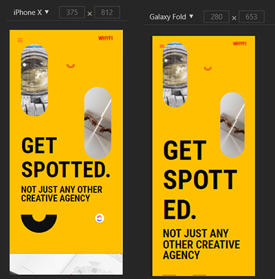
Credit: whyfi.in | Disclaimer: I love the website! Just grabbing a random page that I can use for presentation purpose.
Why Divi Design Tab Cannot Make Your Website Fully Responsive?
Divi only sets 3 breakpoints:
- Desktop: minimum of 981px
- Tablet: maximum of 980px
- Mobile: maximum of 450px
Since smart devices have a lot of resolutions often web developers do some extra work to get the result they want. Now, if you want to target a specific dimension like “Galaxy Fold”, you will need to target its dimension using media query with calc or use clamp.
When I check whyfi.in, I noticed that the h1 is set to 74px unit value. Well, that’s a good approach but the problem of pixel is it doesn’t have scale and it’s way too old.
Let’s pretend that we will target the “Galaxy Fold” with a browser width of “280px”.
Two Options You Can Choose To Add Extra Configuration To Make Your Website Responsive
Calc Way: To make your divi website responsive using calc, you need to set a media query and add a subtraction operator.
OR
Clamp: This is the new way of making your elements responsive without using a media query but since clamp is new. There are some browsers that don’t support clamp so you need to add a fall back.
Note: When setting a unit value, kindly use vw/vh for modules and em/rem for fonts. Divi has a great documentation on how this unit works! Kindly check their article here.